

Hey just a small suggestion for profile pages nothing major using my profile as an example i am sure this is a simple tweak and would just make the Profile page smaller and look cleaner.
Reason : Cause it would look nice next to the Awards that align in the center and to like sum up the bottom of the profile page and reduce space, thanks for looking hope you guys like
Would like to here what people think of these all feedback welcome
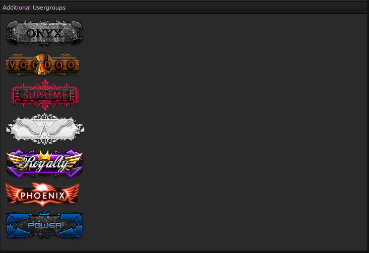
Alignment of the usergroups is like so :
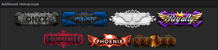
And would be nice to have them like so :
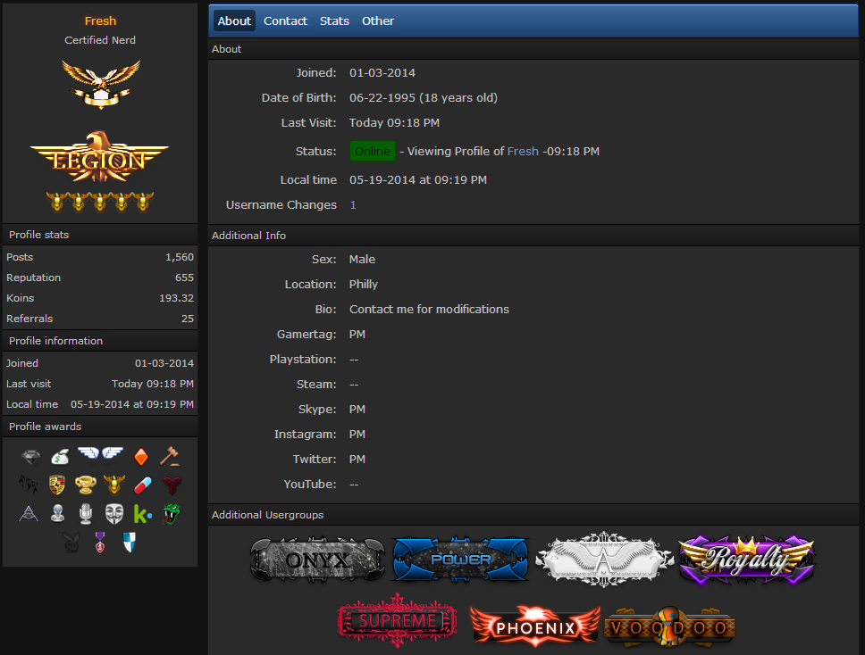
So that the profile page would look like so :
Not sure who has the ability to do this but :
@Philly
@Narc
@Michael
Reason : Cause it would look nice next to the Awards that align in the center and to like sum up the bottom of the profile page and reduce space, thanks for looking hope you guys like
Would like to here what people think of these all feedback welcome
Alignment of the usergroups is like so :
And would be nice to have them like so :
So that the profile page would look like so :
Not sure who has the ability to do this but :
@Philly
@Narc
@Michael


