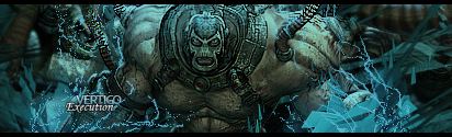
Still sharp as usual mate (The sharpness looks great), I don't see the original render but I can kind of visualise it, I like the (what seems to be)
blue broken up pencil tooling which appears to be looking like veins, or lightning, however you'd like to put it. The text is both beautiful, and beautifully placed, However on the down side I
do like the C4D used on the right there, though I don't like how it's placed there without anything on it... how do you say.. It looks a little 'lonely' if you know what I mean, You have all this stuff happening in the centre then you just look there and it looks pretty plain, I would smudge it in and probably move it a little, though I'm some random noob GFXer, so don't take my word on it, OR you can blur it to create a bit of death.
Your signatures are attractive as usual and you don't seem to be losing it, Great job bro

.
KUTGW!
/no flame, no offense intended at all.


 !!!!! wai?!
