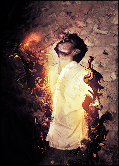
This is a really good piece, Echo. When it comes to criticizing pieces, I'm pretty critical. I'm going to point out the things that I really like, and the things that I dislike in this piece. I'm going to start off with the things that I personally enjoy about this work of art. Clearly your focal point is the guy "requesting" to god for some sort of guidance. It's extremely easy to see the focal point which is an extremely purposeful thing. There's lots of flow in this piece, but in my opinion it lacks depth. I'm a little weary about the purple brush lines you did with the brush tool near the button left part of the picture, too. Some of the smudging you did on the back of the guys head stick out to much in my opinion; I'll post a picture below for you to see what I mean. (I'm unsure if that was the look you were going for or not) IMO this piece is probably one of your better ones. Your render and background match flawlessly; even though it's a large-scale picture, you still seamed to pull it off. You probably don't give a shit what I have to say, but I hope this helped you and I want you to know that you've improved greatly.
Over all, I give this piece a 9/10. I'm definitely in evey about it.