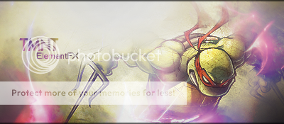
KusHâ„¢ Member Joined Mar 19, 2011 Posts 194 Reacts 0 Reputation 0 Credits 0 Jan 29, 2011 #1 Made this for a request on another forum. I don't like it very much, but he does. Thoughts? I also have a request thread here, if anyone would like to post a request. I have some extra time available.
Made this for a request on another forum. I don't like it very much, but he does. Thoughts? I also have a request thread here, if anyone would like to post a request. I have some extra time available.
Icon Member Joined Mar 19, 2011 Posts 342 Reacts 0 Reputation 0 Credits 0 Jan 29, 2011 #2 Really nice but I think it has a bit to much light over his right arm. Also that purple shadow over his left arm I think it wasn't the best. Overall 8/10
Really nice but I think it has a bit to much light over his right arm. Also that purple shadow over his left arm I think it wasn't the best. Overall 8/10
GameOver User is banned. Joined Mar 19, 2011 Posts 1,636 Reacts 0 Reputation 0 Credits 0 Jan 29, 2011 #3 wow! excellent colors,background,text and render! 10/10
JeterFan428 Active Member Joined Mar 19, 2011 Posts 670 Reacts 0 Reputation 0 Credits 0 Jan 29, 2011 #4 9/10, I agree with Icon.... too much light over his right arm.
Vipul Active Member Joined Mar 19, 2011 Posts 1,013 Reacts 0 Reputation 0 Credits 0 Jan 29, 2011 #5 I rate 8 / 10 The text on the left is cool but the light on the middle is too much
Flow'n Active Member Joined Mar 19, 2011 Posts 2,779 Reacts 0 Reputation 0 Credits 0 Jan 29, 2011 #6 I also think it looks very well, 7.9/10
Altrouge Member Joined Mar 19, 2011 Posts 338 Reacts 0 Reputation 0 Credits 0 Jan 30, 2011 #7 Looks great, jus the lighting is a bit over.
MisterTickle Member Joined Mar 19, 2011 Posts 80 Reacts 0 Reputation 0 Credits 0 Mar 23, 2011 #8 It's pretty cool. Maybe add all of the members of the TMNT. However, it may look a bit clustered. Very good choice of color. I like it. Do you mind if I use this? I mean by copy paste it to some place else?
It's pretty cool. Maybe add all of the members of the TMNT. However, it may look a bit clustered. Very good choice of color. I like it. Do you mind if I use this? I mean by copy paste it to some place else?
Vipul Active Member Joined Mar 19, 2011 Posts 1,013 Reacts 0 Reputation 0 Credits 0 Mar 24, 2011 #9 Where is request thread? In which board? I'll check it out because I want a new one to make my sign.
Flow'n Active Member Joined Mar 19, 2011 Posts 2,779 Reacts 0 Reputation 0 Credits 0 Mar 24, 2011 #10 Request section is called rate my work.. MisterTickle don't use the picture until kush gives you the OK.
Request section is called rate my work.. MisterTickle don't use the picture until kush gives you the OK.
iSk Member Joined Mar 19, 2011 Posts 190 Reacts 0 Reputation 0 Credits 0 Mar 24, 2011 #11 I agree with everyone. Its more bright on the top of the right arm. Else, it just seems awesome. I guess, I should too make one, though I'm not a pro
I agree with everyone. Its more bright on the top of the right arm. Else, it just seems awesome. I guess, I should too make one, though I'm not a pro